

Your graphics add a nice touch to my presentations and I recently used them for one of my all-hands meetings. Your toolbox adds professionalism to my slides. Instead of using standard clipart.
Claude Jones, Director of Engineer, @Walmartlabs, USA

Your graphics add a nice touch to my presentations and I recently used them for one of my all-hands meetings. Your toolbox adds professionalism to my slides. Instead of using standard clipart.
Claude Jones, Director of Engineer, @Walmartlabs, USA
I needed a fresh look at some of my slides. I've tried to find a way to create a paintbrush effect, to underline, accentuate, add some color and the handwritten markers were just the things. Very easy to use, easy to size, change the color. It was an affordable, perfect solution and I'm happy to recommend it.
Anonymous, US
The crisp, clean look of the graphics, and the fact that it allowed me to easily edit and change the colors to match the template was my main reason for purchasing them.
Brandie Jenkins, E-learning Developer, USA
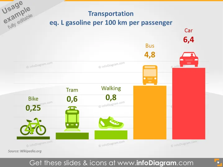
The slide presents a comparison of transportation methods and their respective equivalent liters of gasoline consumed per 100 kilometers per passenger. The most efficient mode is 'Bike' at 0.25L, followed by 'Tram' at 0.6L, 'Walking' at 0.8L, 'Bus' at 4.8L, and the least efficient is 'Car' at 6.4L. This gives a clear picture of the relative energy efficiencies of different forms of transportation with respect to fuel consumption, beneficial in discussions of sustainability and environmental impact.
The slide employs a clean and simple design, using both color-coded bars and icons for visual representation, making the data easily understandable at a glance.



