Your graphics add a nice touch to my presentations and I recently used them for one of my all-hands meetings. Your toolbox adds professionalism to my slides. Instead of using standard clipart.
Claude Jones, Director of Engineer, @Walmartlabs, USA
Your graphics add a nice touch to my presentations and I recently used them for one of my all-hands meetings. Your toolbox adds professionalism to my slides. Instead of using standard clipart.
Claude Jones, Director of Engineer, @Walmartlabs, USA
I needed a fresh look at some of my slides. I've tried to find a way to create a paintbrush effect, to underline, accentuate, add some color and the handwritten markers were just the things. Very easy to use, easy to size, change the color. It was an affordable, perfect solution and I'm happy to recommend it.
Anonymous, US
The crisp, clean look of the graphics, and the fact that it allowed me to easily edit and change the colors to match the template was my main reason for purchasing them.
Brandie Jenkins, E-learning Developer, USA
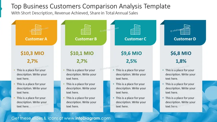
The PowerPoint slide titled "Top Business Customers Comparison Analysis Template" presents a comparative analysis of top customers with respect to revenue and proportion of total annual sales. Four separate blocks labeled Customer A, Customer B, Customer C, and Customer D display their respective revenue figures and sales percentages. Each block provides bullet points for additional descriptions, helping the audience understand how each customer contributes to the business's overall sales.
The overall look of the slide is clean and modern, with a clear differentiation between segments through the use of color. The layout supports easy comparison and quick understanding between the customer's categories and their data points.


