Your graphics add a nice touch to my presentations and I recently used them for one of my all-hands meetings. Your toolbox adds professionalism to my slides. Instead of using standard clipart.
Claude Jones, Director of Engineer, @Walmartlabs, USA
Your graphics add a nice touch to my presentations and I recently used them for one of my all-hands meetings. Your toolbox adds professionalism to my slides. Instead of using standard clipart.
Claude Jones, Director of Engineer, @Walmartlabs, USA
I needed a fresh look at some of my slides. I've tried to find a way to create a paintbrush effect, to underline, accentuate, add some color and the handwritten markers were just the things. Very easy to use, easy to size, change the color. It was an affordable, perfect solution and I'm happy to recommend it.
Anonymous, US
The crisp, clean look of the graphics, and the fact that it allowed me to easily edit and change the colors to match the template was my main reason for purchasing them.
Brandie Jenkins, E-learning Developer, USA
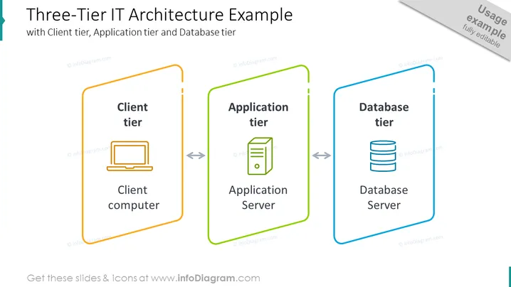
The slide presents the concept of a "Three-Tier IT Architecture," which typically entails a Client tier, Application tier, and Database tier. The Client tier is marked by the icon of a desktop computer, implying the user interface layer where users interact. The Application tier has an icon representing an application server, indicating the logic layer where data processing happens. Finally, the Database tier shows a stacked database symbol, reflecting the data storage layer where data is managed and stored securely.
The overall look of the slide is minimalistic and informative, with a clear distinction between the layers of IT architecture. The use of color and icons makes the information approachable and easy to digest.


