Your graphics add a nice touch to my presentations and I recently used them for one of my all-hands meetings. Your toolbox adds professionalism to my slides. Instead of using standard clipart.
Claude Jones, Director of Engineer, @Walmartlabs, USA
Your graphics add a nice touch to my presentations and I recently used them for one of my all-hands meetings. Your toolbox adds professionalism to my slides. Instead of using standard clipart.
Claude Jones, Director of Engineer, @Walmartlabs, USA
I needed a fresh look at some of my slides. I've tried to find a way to create a paintbrush effect, to underline, accentuate, add some color and the handwritten markers were just the things. Very easy to use, easy to size, change the color. It was an affordable, perfect solution and I'm happy to recommend it.
Anonymous, US
The crisp, clean look of the graphics, and the fact that it allowed me to easily edit and change the colors to match the template was my main reason for purchasing them.
Brandie Jenkins, E-learning Developer, USA
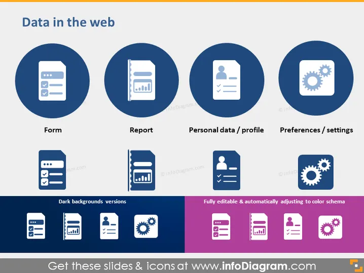
The slide presents various aspects of user interaction with data on the web, each represented by an icon within a circular frame. "Form" suggests data entry or submission interfaces, like contact forms on websites. "Report" conveys the generation or reception of structured data, such as analytics or summaries. "Personal data / profile" deals with user-specific information stored on platforms, reflecting account details or identity information. "Preferences / settings" indicates customizable user options within applications or services, highlighting personalization and configuration.
The overall slide has a clean, modern layout with a good use of icons to visually represent the core concepts. The color scheme is consistent, using shades of blue and purple that are easy on the eyes.


