Your graphics add a nice touch to my presentations and I recently used them for one of my all-hands meetings. Your toolbox adds professionalism to my slides. Instead of using standard clipart.
Claude Jones, Director of Engineer, @Walmartlabs, USA
Your graphics add a nice touch to my presentations and I recently used them for one of my all-hands meetings. Your toolbox adds professionalism to my slides. Instead of using standard clipart.
Claude Jones, Director of Engineer, @Walmartlabs, USA
I needed a fresh look at some of my slides. I've tried to find a way to create a paintbrush effect, to underline, accentuate, add some color and the handwritten markers were just the things. Very easy to use, easy to size, change the color. It was an affordable, perfect solution and I'm happy to recommend it.
Anonymous, US
The crisp, clean look of the graphics, and the fact that it allowed me to easily edit and change the colors to match the template was my main reason for purchasing them.
Brandie Jenkins, E-learning Developer, USA
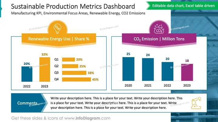
The slide titled 'Sustainable Production Metrics Dashboard' emphasizes the importance of monitoring environmental aspects within manufacturing processes, specifically focusing on the use of renewable energy and carbon dioxide (CO2) emissions. The slide features two main sections: 'Renewable Energy Use | Share %' displaying a yearly comparison of renewable energy usage in percentage for four quarters (Q1-Q4) with an increasing trend from 20% to 45%; and 'CO2 Emission | Million Tons' showcasing a descending bar chart depicting annual CO2 emissions from 2020 to 2023 in million tons, illustrating a reduction from 25 to 18 million tons. Below the charts, there's a placeholder labeled 'Comments' for additional text.
The overall look of the slide is modern and professional, with a clear emphasis on readability and data visualization. The color coding is intuitive, using warm colors for energy and cooler ones for emissions, which helps in quickly distinguishing between the data sets.


