Your graphics add a nice touch to my presentations and I recently used them for one of my all-hands meetings. Your toolbox adds professionalism to my slides. Instead of using standard clipart.
Claude Jones, Director of Engineer, @Walmartlabs, USA
Your graphics add a nice touch to my presentations and I recently used them for one of my all-hands meetings. Your toolbox adds professionalism to my slides. Instead of using standard clipart.
Claude Jones, Director of Engineer, @Walmartlabs, USA
I needed a fresh look at some of my slides. I've tried to find a way to create a paintbrush effect, to underline, accentuate, add some color and the handwritten markers were just the things. Very easy to use, easy to size, change the color. It was an affordable, perfect solution and I'm happy to recommend it.
Anonymous, US
The crisp, clean look of the graphics, and the fact that it allowed me to easily edit and change the colors to match the template was my main reason for purchasing them.
Brandie Jenkins, E-learning Developer, USA
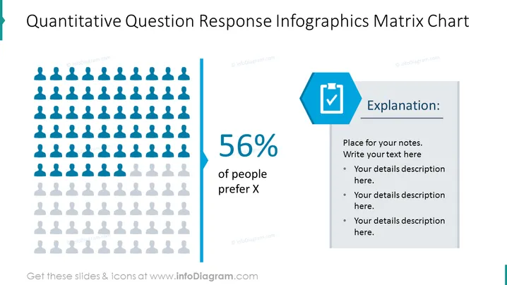
The slide is designed to present the results of a quantitative question, specifically highlighting that 56% of people prefer option X. It utilizes an infographic representation with human silhouettes to visually depict the statistical data, while a side panel provides space for an explanation or detailed notes. This allows for a concise summary paired with the opportunity for expanded insight, ideal for conveying survey results or demographic preferences.
The slide is dominated by shades of blue and gray, creating a professional and clean visual. The use of human silhouettes adds an element of relatability and the separation of elements allows for an easy reading experience.


