Your graphics add a nice touch to my presentations and I recently used them for one of my all-hands meetings. Your toolbox adds professionalism to my slides. Instead of using standard clipart.
Claude Jones, Director of Engineer, @Walmartlabs, USA
Your graphics add a nice touch to my presentations and I recently used them for one of my all-hands meetings. Your toolbox adds professionalism to my slides. Instead of using standard clipart.
Claude Jones, Director of Engineer, @Walmartlabs, USA
I needed a fresh look at some of my slides. I've tried to find a way to create a paintbrush effect, to underline, accentuate, add some color and the handwritten markers were just the things. Very easy to use, easy to size, change the color. It was an affordable, perfect solution and I'm happy to recommend it.
Anonymous, US
The crisp, clean look of the graphics, and the fact that it allowed me to easily edit and change the colors to match the template was my main reason for purchasing them.
Brandie Jenkins, E-learning Developer, USA
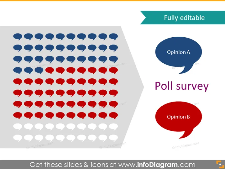
The slide represents a poll survey with a visual distribution of votes or opinions. Blue and red speech bubbles symbolize Opinion A and Opinion B, respectively, indicating two contrasting viewpoints or answers. The amount of each color suggests the number or proportion of responses for each opinion, with grayed-out bubbles seemingly representing uncast votes or a baseline for comparative purposes.
The overall look of the slide is clean and modern, employing simple shapes (speech bubbles) and a clear color coding (blue and red) to convey polling data visually. It strategically uses opacity to distinguish between active responses and a baseline or potential responses.


