Your graphics add a nice touch to my presentations and I recently used them for one of my all-hands meetings. Your toolbox adds professionalism to my slides. Instead of using standard clipart.
Claude Jones, Director of Engineer, @Walmartlabs, USA
Your graphics add a nice touch to my presentations and I recently used them for one of my all-hands meetings. Your toolbox adds professionalism to my slides. Instead of using standard clipart.
Claude Jones, Director of Engineer, @Walmartlabs, USA
I needed a fresh look at some of my slides. I've tried to find a way to create a paintbrush effect, to underline, accentuate, add some color and the handwritten markers were just the things. Very easy to use, easy to size, change the color. It was an affordable, perfect solution and I'm happy to recommend it.
Anonymous, US
The crisp, clean look of the graphics, and the fact that it allowed me to easily edit and change the colors to match the template was my main reason for purchasing them.
Brandie Jenkins, E-learning Developer, USA
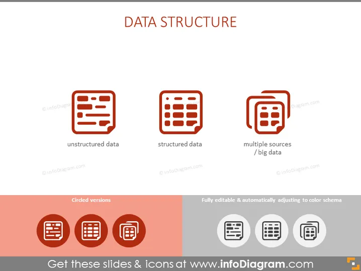
The PowerPoint slide is titled "DATA STRUCTURE" with three main points. "Unstructured data" refers to information that doesn't follow a specified format, making it difficult to collect, process, and analyze. "Structured data" means data that is organized in a fixed field within a record or file, such as spreadsheets, which makes it easily searchable. "Multiple sources / big data" suggests the integration of data from various repositories or formats, indicating complexity and scale.
The slide has a clean and modern look with a well-balanced layout. The icons are simple and visually communicate the types of data structures introduced on the slide.


