Your graphics add a nice touch to my presentations and I recently used them for one of my all-hands meetings. Your toolbox adds professionalism to my slides. Instead of using standard clipart.
Claude Jones, Director of Engineer, @Walmartlabs, USA
Your graphics add a nice touch to my presentations and I recently used them for one of my all-hands meetings. Your toolbox adds professionalism to my slides. Instead of using standard clipart.
Claude Jones, Director of Engineer, @Walmartlabs, USA
I needed a fresh look at some of my slides. I've tried to find a way to create a paintbrush effect, to underline, accentuate, add some color and the handwritten markers were just the things. Very easy to use, easy to size, change the color. It was an affordable, perfect solution and I'm happy to recommend it.
Anonymous, US
The crisp, clean look of the graphics, and the fact that it allowed me to easily edit and change the colors to match the template was my main reason for purchasing them.
Brandie Jenkins, E-learning Developer, USA
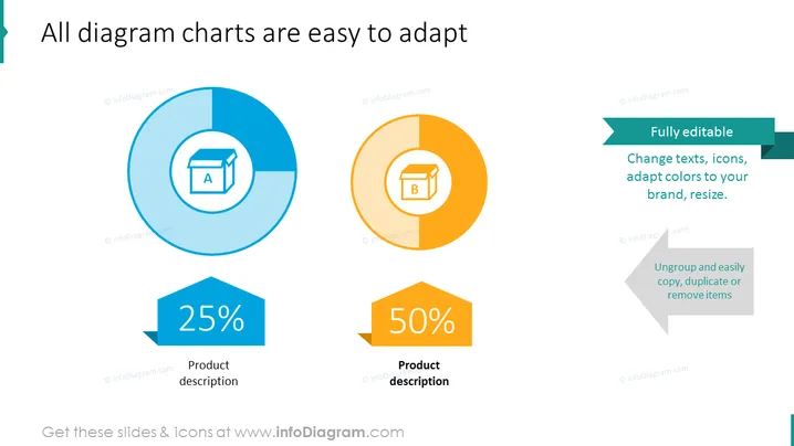
The PowerPoint slide demonstrates the adaptability of diagram charts. It showcases two pie charts with 25% and 50% sections highlighted, each accompanied by a hexagon with a percentage and product description; implying the ability to tailor the charts to various data points. The right side of the slide promotes the full editability of these charts, with the flexibility to change texts, icons, adapt colors to a brand, and resize, as well as the simplicity of ungrouping to copy, duplicate, or remove items. Each feature provides straightforward tools for customization, ensuring the charts can be matched to different branding styles or presentation needs with ease.
The slide carries a professional and modern look with a balance between graphical elements and informative text. The use of contrasting colors and distinct shapes helps distinguish different parts of the message effectively.


