Your graphics add a nice touch to my presentations and I recently used them for one of my all-hands meetings. Your toolbox adds professionalism to my slides. Instead of using standard clipart.
Claude Jones, Director of Engineer, @Walmartlabs, USA
Your graphics add a nice touch to my presentations and I recently used them for one of my all-hands meetings. Your toolbox adds professionalism to my slides. Instead of using standard clipart.
Claude Jones, Director of Engineer, @Walmartlabs, USA
I needed a fresh look at some of my slides. I've tried to find a way to create a paintbrush effect, to underline, accentuate, add some color and the handwritten markers were just the things. Very easy to use, easy to size, change the color. It was an affordable, perfect solution and I'm happy to recommend it.
Anonymous, US
The crisp, clean look of the graphics, and the fact that it allowed me to easily edit and change the colors to match the template was my main reason for purchasing them.
Brandie Jenkins, E-learning Developer, USA
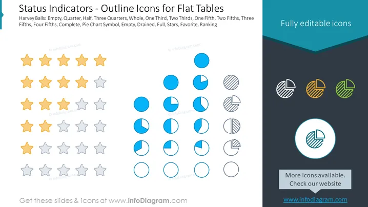
The slide provides a visual representation of various status indicators using iconography, primarily used for showing progress or completion levels in flat table formats. The icons include Harvey Balls at various fill stages – Empty, Quarter, Half, Three Quarters, Whole, One Third, Two Thirds, One Fifth, Two Fifths, Three Fifths, Four Fifths, Complete – and additionally a pie chart symbol with variations of filling, with descriptors such as Empty, Drained, Full, Stars, Favorite, Ranking. These icons can communicate different states of project phases or performance levels, ranging from not started (empty) to fully complete (whole or full).
The slide displays a simplistic yet efficient design, using visual elements that convey data statuses through easily interpretable icons. The various icons employ color contrasts and fill patterns effectively to represent the amount of completion or status.
The slide titled "Status Indicators – Outline Icons for Flat Tables" showcases a variety of graphical icons that can be used to indicate different status levels within tables. There are three categories presented: Harvey Balls, solid circles, and pie charts, with each category featuring different fill levels such as empty, quarter, half, three-quarters, and full. The Slide Content header explains that these images can represent various proportions like one third, two thirds, one fifth, two fifths, three fifths, four fifths, as well as symbols indicating completion, preference or ranking such as pie chart symbol, empty, drained, full, stars, favorite, and ranking. These visual elements simplify the communication of progress, quality or satisfaction levels.
The slide is designed to be clean and structured, with a harmonious balance of text and visual elements. Color coding is used strategically to differentiate between the types of indicators, aiding in quick visual recognition.


