Your graphics add a nice touch to my presentations and I recently used them for one of my all-hands meetings. Your toolbox adds professionalism to my slides. Instead of using standard clipart.
Claude Jones, Director of Engineer, @Walmartlabs, USA
Your graphics add a nice touch to my presentations and I recently used them for one of my all-hands meetings. Your toolbox adds professionalism to my slides. Instead of using standard clipart.
Claude Jones, Director of Engineer, @Walmartlabs, USA
I needed a fresh look at some of my slides. I've tried to find a way to create a paintbrush effect, to underline, accentuate, add some color and the handwritten markers were just the things. Very easy to use, easy to size, change the color. It was an affordable, perfect solution and I'm happy to recommend it.
Anonymous, US
The crisp, clean look of the graphics, and the fact that it allowed me to easily edit and change the colors to match the template was my main reason for purchasing them.
Brandie Jenkins, E-learning Developer, USA
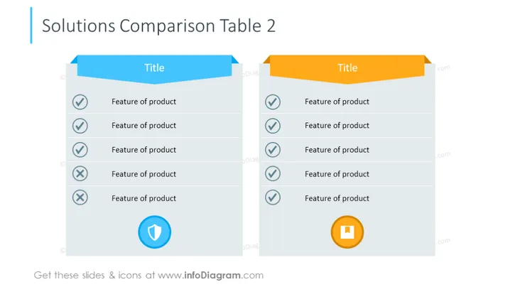
The slide presents a comparison of two different solutions with their respective features. Each solution has a distinct colored title banner and a list of features underneath. The features are each marked with a check mark for positive attributes or a cross for negative attributes, indicating their presence or absence in the product. There is also a graphical representation of approval or disapproval at the bottom of each list, further emphasizing the product's strengths or weaknesses.
The overall design of the slide is clean and modern with a 3D effect given to the feature comparison tables. The use of contrasting colors for the titles and check/cross icons makes it easy to distinguish between the two solutions being compared.


