Your graphics add a nice touch to my presentations and I recently used them for one of my all-hands meetings. Your toolbox adds professionalism to my slides. Instead of using standard clipart.
Claude Jones, Director of Engineer, @Walmartlabs, USA
Your graphics add a nice touch to my presentations and I recently used them for one of my all-hands meetings. Your toolbox adds professionalism to my slides. Instead of using standard clipart.
Claude Jones, Director of Engineer, @Walmartlabs, USA
I needed a fresh look at some of my slides. I've tried to find a way to create a paintbrush effect, to underline, accentuate, add some color and the handwritten markers were just the things. Very easy to use, easy to size, change the color. It was an affordable, perfect solution and I'm happy to recommend it.
Anonymous, US
The crisp, clean look of the graphics, and the fact that it allowed me to easily edit and change the colors to match the template was my main reason for purchasing them.
Brandie Jenkins, E-learning Developer, USA
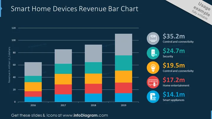
The slide shows a bar chart representing the revenue from smart home devices over a period from 2016 to 2019. Each bar is segmented into different colors that correspond to specific categories listed on the right side of the slide, each with associated revenue figures: $35.2 million for Control and Connectivity, $24.7 million for Security, $19.5 million for additional Control and Connectivity, $17.2 million for Home Entertainment, and $14.1 million for Smart Appliances. This suggests a diversification of revenue streams within the smart home device market.
The slide has a clean and professional visual design with a clear layout that facilitates quick comprehension of data. The use of color-coding with corresponding icons provides an efficient way to cross-reference data points within the chart.


