Your graphics add a nice touch to my presentations and I recently used them for one of my all-hands meetings. Your toolbox adds professionalism to my slides. Instead of using standard clipart.
Claude Jones, Director of Engineer, @Walmartlabs, USA
Your graphics add a nice touch to my presentations and I recently used them for one of my all-hands meetings. Your toolbox adds professionalism to my slides. Instead of using standard clipart.
Claude Jones, Director of Engineer, @Walmartlabs, USA
I needed a fresh look at some of my slides. I've tried to find a way to create a paintbrush effect, to underline, accentuate, add some color and the handwritten markers were just the things. Very easy to use, easy to size, change the color. It was an affordable, perfect solution and I'm happy to recommend it.
Anonymous, US
The crisp, clean look of the graphics, and the fact that it allowed me to easily edit and change the colors to match the template was my main reason for purchasing them.
Brandie Jenkins, E-learning Developer, USA
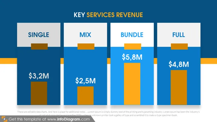
The PowerPoint slide titled "KEY SERVICES REVENUE" appears to represent revenue data for a business, broken down into four categories: Single, Mix, Bundle, and Full. Each category has a corresponding revenue value associated with it: Single shows $3.2M, Mix indicates $2.5M, Bundle is at $5.8M, and Full displays $4.8M. These values suggest the revenue generated from different service offerings or product combinations, potentially indicating a strategy where bundled offerings generate the most revenue.
The visual composition of the slide is clean and professional, with a strong contrast between the background and bar charts. The use of blue and orange maintains a corporate aesthetic, while the white text stands out for easy readability.


