Your graphics add a nice touch to my presentations and I recently used them for one of my all-hands meetings. Your toolbox adds professionalism to my slides. Instead of using standard clipart.
Claude Jones, Director of Engineer, @Walmartlabs, USA
Your graphics add a nice touch to my presentations and I recently used them for one of my all-hands meetings. Your toolbox adds professionalism to my slides. Instead of using standard clipart.
Claude Jones, Director of Engineer, @Walmartlabs, USA
I needed a fresh look at some of my slides. I've tried to find a way to create a paintbrush effect, to underline, accentuate, add some color and the handwritten markers were just the things. Very easy to use, easy to size, change the color. It was an affordable, perfect solution and I'm happy to recommend it.
Anonymous, US
The crisp, clean look of the graphics, and the fact that it allowed me to easily edit and change the colors to match the template was my main reason for purchasing them.
Brandie Jenkins, E-learning Developer, USA
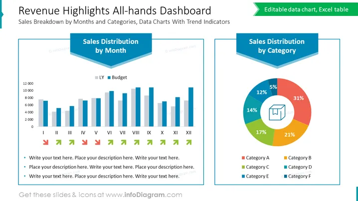
##Revenue Highlights All-hands Dashboard Slide
This simple dashboard illustrates sales distribution by month and by category using a bar chart with trend icons and a pie chart. You can highlight key metrics on Excel-driven diagrams and describe them in detail in the comment section below. All elements can be modified in size and color to match your branding.
##What Does This Revenue Highlights All-hands Dashboard Slide Include?
This Revenue Highlights All-hands Dashboard Slide is a part of our Company Town Hall Meeting Presentation PPT Template.


