Your graphics add a nice touch to my presentations and I recently used them for one of my all-hands meetings. Your toolbox adds professionalism to my slides. Instead of using standard clipart.
Claude Jones, Director of Engineer, @Walmartlabs, USA
Your graphics add a nice touch to my presentations and I recently used them for one of my all-hands meetings. Your toolbox adds professionalism to my slides. Instead of using standard clipart.
Claude Jones, Director of Engineer, @Walmartlabs, USA
I needed a fresh look at some of my slides. I've tried to find a way to create a paintbrush effect, to underline, accentuate, add some color and the handwritten markers were just the things. Very easy to use, easy to size, change the color. It was an affordable, perfect solution and I'm happy to recommend it.
Anonymous, US
The crisp, clean look of the graphics, and the fact that it allowed me to easily edit and change the colors to match the template was my main reason for purchasing them.
Brandie Jenkins, E-learning Developer, USA
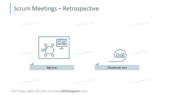
The PowerPoint slide is titled "Scrum Meetings – Retrospective" and displays two contrasting image styles used to represent visual elements in presentations. The "Big icon" signifies a more detailed and larger view of a concept, helpful for emphasis or focal points, while the "Thumbnail icon" represents a simplified and smaller version, useful for previews or summaries. Both icons are abstract representations of user interface elements, indicating different degrees of content visualization.
The overall look of the slide is clean and professional, utilizing a minimal color palette and simple geometric shapes for a clear comparison between the two icon styles.


