Your graphics add a nice touch to my presentations and I recently used them for one of my all-hands meetings. Your toolbox adds professionalism to my slides. Instead of using standard clipart.
Claude Jones, Director of Engineer, @Walmartlabs, USA
Your graphics add a nice touch to my presentations and I recently used them for one of my all-hands meetings. Your toolbox adds professionalism to my slides. Instead of using standard clipart.
Claude Jones, Director of Engineer, @Walmartlabs, USA
I needed a fresh look at some of my slides. I've tried to find a way to create a paintbrush effect, to underline, accentuate, add some color and the handwritten markers were just the things. Very easy to use, easy to size, change the color. It was an affordable, perfect solution and I'm happy to recommend it.
Anonymous, US
The crisp, clean look of the graphics, and the fact that it allowed me to easily edit and change the colors to match the template was my main reason for purchasing them.
Brandie Jenkins, E-learning Developer, USA
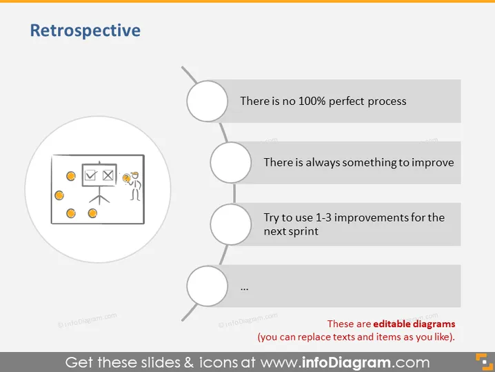
The slide titled "Retrospective" is about evaluating and improving processes, suggesting that there is always room for improvement and that continual enhancements should be made. The main takeaways are that a perfect process does not exist, implying that there is always potential for refinement; that there is always something to improve, stressing the ongoing nature of process optimization; and to try to use 1-3 improvements for the next sprint, suggesting a practical approach to incremental change by selecting a few actionable items.
The overall look of the slide is minimalist with a balanced use of graphics and text. The icons are simple and the color scheme is mostly monochrome with a touch of blue for the title.


