Your graphics add a nice touch to my presentations and I recently used them for one of my all-hands meetings. Your toolbox adds professionalism to my slides. Instead of using standard clipart.
Claude Jones, Director of Engineer, @Walmartlabs, USA
Your graphics add a nice touch to my presentations and I recently used them for one of my all-hands meetings. Your toolbox adds professionalism to my slides. Instead of using standard clipart.
Claude Jones, Director of Engineer, @Walmartlabs, USA
I needed a fresh look at some of my slides. I've tried to find a way to create a paintbrush effect, to underline, accentuate, add some color and the handwritten markers were just the things. Very easy to use, easy to size, change the color. It was an affordable, perfect solution and I'm happy to recommend it.
Anonymous, US
The crisp, clean look of the graphics, and the fact that it allowed me to easily edit and change the colors to match the template was my main reason for purchasing them.
Brandie Jenkins, E-learning Developer, USA
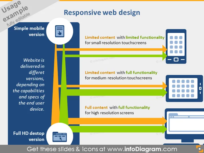
The slide titled "Responsive web design" explains the concept of delivering a website in different versions optimized for various devices. It highlights three types of device adaptation: a "Simple mobile version" with limited content and functionality for small resolution touchscreens, a medium resolution version offering limited content but full functionality, and a "Full HD desktop version" that provides full content with full functionality for high-resolution screens. Each version is designed to cater to the specific capabilities and specifications of the end user's device.
The overall look of the slide is clean and modern, with a clear visual hierarchy that guides the viewer through the content. The color-coded elements and device icons effectively communicate the concept of responsive web design.