
Your graphics add a nice touch to my presentations and I recently used them for one of my all-hands meetings. Your toolbox adds professionalism to my slides. Instead of using standard clipart.
Claude Jones, Director of Engineer, @Walmartlabs, USA

Your graphics add a nice touch to my presentations and I recently used them for one of my all-hands meetings. Your toolbox adds professionalism to my slides. Instead of using standard clipart.
Claude Jones, Director of Engineer, @Walmartlabs, USA
I needed a fresh look at some of my slides. I've tried to find a way to create a paintbrush effect, to underline, accentuate, add some color and the handwritten markers were just the things. Very easy to use, easy to size, change the color. It was an affordable, perfect solution and I'm happy to recommend it.
Anonymous, US
The crisp, clean look of the graphics, and the fact that it allowed me to easily edit and change the colors to match the template was my main reason for purchasing them.
Brandie Jenkins, E-learning Developer, USA
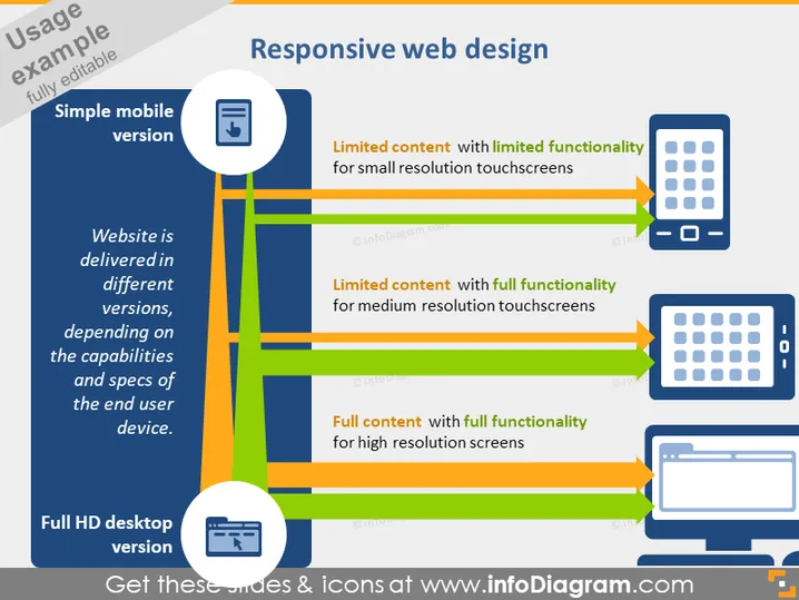
The PowerPoint slide outlines the concept of "Responsive web design," highlighting that a website is delivered in different versions adapted to the end-user's device capabilities and specifications. Three types of devices are shown: simple mobile, medium resolution touchscreens, and full HD desktops, each with varying content accessibility and functionality. The simple mobile version offers limited content with limited functionality, illustrating that less information is displayed on smaller screens. Medium resolution touchscreens provide limited content but maintain full functionality, indicating that users can interact fully even with reduced display space. The full HD desktop version showcases full content with full functionality, ensuring that the user gets the complete website experience without any restrictions due to screen size or resolution.
The slide has a clean, modern look with a color scheme that prioritizes clarity and visual hierarchy. The use of shape and color emphasizes the information flow and distinguishes between different device resolutions.