Your graphics add a nice touch to my presentations and I recently used them for one of my all-hands meetings. Your toolbox adds professionalism to my slides. Instead of using standard clipart.
Claude Jones, Director of Engineer, @Walmartlabs, USA
Your graphics add a nice touch to my presentations and I recently used them for one of my all-hands meetings. Your toolbox adds professionalism to my slides. Instead of using standard clipart.
Claude Jones, Director of Engineer, @Walmartlabs, USA
I needed a fresh look at some of my slides. I've tried to find a way to create a paintbrush effect, to underline, accentuate, add some color and the handwritten markers were just the things. Very easy to use, easy to size, change the color. It was an affordable, perfect solution and I'm happy to recommend it.
Anonymous, US
The crisp, clean look of the graphics, and the fact that it allowed me to easily edit and change the colors to match the template was my main reason for purchasing them.
Brandie Jenkins, E-learning Developer, USA
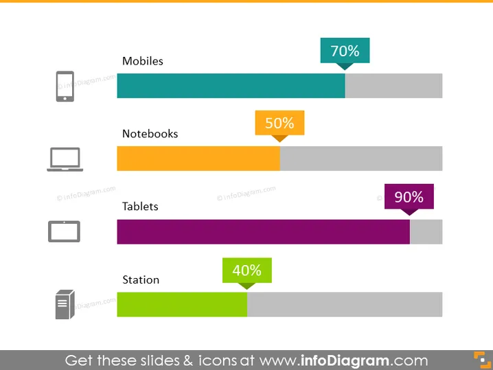
The slide appears to represent a comparison of usage or market penetration statistics for different types of devices. "Mobiles" have a 70% value, suggesting they are quite common or preferred among the categories shown. "Notebooks" are at 50%, indicating a moderate level of use or adoption. "Tablets" have the highest value at 90%, which could mean they are the most used or have the highest market share in this comparison. Lastly, "Station" seems to refer to desktop computers with a 40% value, possibly the least favored or the ones with the lowest market penetration among the listed devices.
The slide has a simple and clean design that effectively utilizes color and icons to convey information at a glance. The colored bars serve as a visual aid to quickly assess the relative values of each category.


