Your graphics add a nice touch to my presentations and I recently used them for one of my all-hands meetings. Your toolbox adds professionalism to my slides. Instead of using standard clipart.
Claude Jones, Director of Engineer, @Walmartlabs, USA
Your graphics add a nice touch to my presentations and I recently used them for one of my all-hands meetings. Your toolbox adds professionalism to my slides. Instead of using standard clipart.
Claude Jones, Director of Engineer, @Walmartlabs, USA
I needed a fresh look at some of my slides. I've tried to find a way to create a paintbrush effect, to underline, accentuate, add some color and the handwritten markers were just the things. Very easy to use, easy to size, change the color. It was an affordable, perfect solution and I'm happy to recommend it.
Anonymous, US
The crisp, clean look of the graphics, and the fact that it allowed me to easily edit and change the colors to match the template was my main reason for purchasing them.
Brandie Jenkins, E-learning Developer, USA
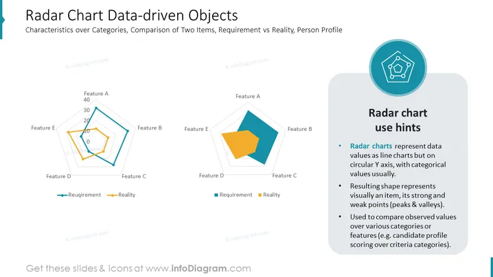
The slide titled "Radar Chart Data-driven Objects" focuses on the utilization of radar charts for showcasing characteristics across categories and comparing two items, such as requirements versus reality, or analyzing a person's profile. On the left, two radar charts depict contrasting data sets labeled 'Requirement' and 'Reality', using different colored lines to distinguish between the expected and actual values of features labeled from A to E. The right side of the slide presents "Radar chart use hints," explaining that radar charts plot data on a circular axis, creating an easily interpretable visual showcasing an item's strengths and weaknesses and are particularly useful for comparing features across various criteria.
The overall look of the slide is professional and well-organized, with a good balance between visual elements (charts and icon) and informative text, facilitating an easy understanding of the radar chart concept.


