Your graphics add a nice touch to my presentations and I recently used them for one of my all-hands meetings. Your toolbox adds professionalism to my slides. Instead of using standard clipart.
Claude Jones, Director of Engineer, @Walmartlabs, USA
Your graphics add a nice touch to my presentations and I recently used them for one of my all-hands meetings. Your toolbox adds professionalism to my slides. Instead of using standard clipart.
Claude Jones, Director of Engineer, @Walmartlabs, USA
I needed a fresh look at some of my slides. I've tried to find a way to create a paintbrush effect, to underline, accentuate, add some color and the handwritten markers were just the things. Very easy to use, easy to size, change the color. It was an affordable, perfect solution and I'm happy to recommend it.
Anonymous, US
The crisp, clean look of the graphics, and the fact that it allowed me to easily edit and change the colors to match the template was my main reason for purchasing them.
Brandie Jenkins, E-learning Developer, USA
Slide title. Text + picture
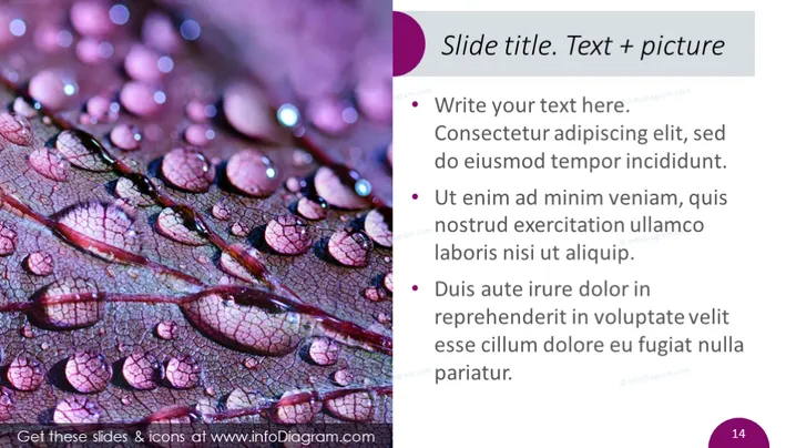
The PowerPoint slide is likely designed to showcase how text descriptions can complement an image. The title indicates a dual focus on textual and visual information, suggesting a balance between the two methods of communication. The slide contains bullet points offering placeholder text which demonstrates how one could structure information in a concise, easy-to-read manner. These bullet points are probably meant to be replaced with relevant content to suit a specific presentation topic.
The overall look of the slide is polished and visually balanced, with a clear division between the image and the text area. The choice of colors creates a cohesive theme, while the clear differentiation of text styles allows for easy reading.


