Your graphics add a nice touch to my presentations and I recently used them for one of my all-hands meetings. Your toolbox adds professionalism to my slides. Instead of using standard clipart.
Claude Jones, Director of Engineer, @Walmartlabs, USA
Your graphics add a nice touch to my presentations and I recently used them for one of my all-hands meetings. Your toolbox adds professionalism to my slides. Instead of using standard clipart.
Claude Jones, Director of Engineer, @Walmartlabs, USA
I needed a fresh look at some of my slides. I've tried to find a way to create a paintbrush effect, to underline, accentuate, add some color and the handwritten markers were just the things. Very easy to use, easy to size, change the color. It was an affordable, perfect solution and I'm happy to recommend it.
Anonymous, US
The crisp, clean look of the graphics, and the fact that it allowed me to easily edit and change the colors to match the template was my main reason for purchasing them.
Brandie Jenkins, E-learning Developer, USA
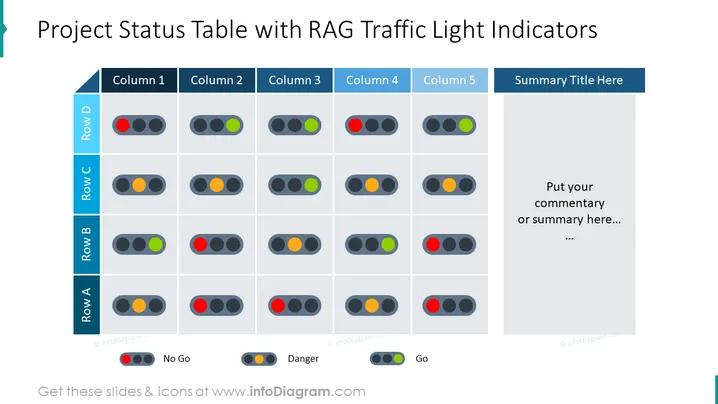
This PowerPoint slide is titled "Project Status Table with RAG Traffic Light Indicators" and uses RAG (Red, Amber, Green) traffic light colors to denote project status. Four rows labeled A to D and five columns represent different metrics or categories for monitoring. Each cell within the table contains a set of three traffic lights, with red signifying "No Go," amber "Danger," and green "Go," providing an immediate visual representation of the project areas' status. On the right side, there's a section for a "Summary Title" and a placeholder for commentary or summarization of the table's contents. This conciseness supports quick scanning and decision-making.
The overall design is clean, with a professional look, and uses colors purposefully to categorize and prioritize information visually. It effectively balances text, color, and graphical elements to convey status at a glance.


