Your graphics add a nice touch to my presentations and I recently used them for one of my all-hands meetings. Your toolbox adds professionalism to my slides. Instead of using standard clipart.
Claude Jones, Director of Engineer, @Walmartlabs, USA
Your graphics add a nice touch to my presentations and I recently used them for one of my all-hands meetings. Your toolbox adds professionalism to my slides. Instead of using standard clipart.
Claude Jones, Director of Engineer, @Walmartlabs, USA
I needed a fresh look at some of my slides. I've tried to find a way to create a paintbrush effect, to underline, accentuate, add some color and the handwritten markers were just the things. Very easy to use, easy to size, change the color. It was an affordable, perfect solution and I'm happy to recommend it.
Anonymous, US
The crisp, clean look of the graphics, and the fact that it allowed me to easily edit and change the colors to match the template was my main reason for purchasing them.
Brandie Jenkins, E-learning Developer, USA
##Products Market Share Comparison Chart Diagram
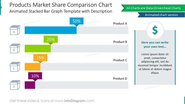
Use this creative Excel data-driven diagram to compare the product's market share results on bar charts. This slide contained an animated stacked bar graph template illustrated with visuals symbolizing products. To give a complete picture, use the text container on the side to add your description.
##What Does This Products Market Share Comparison Chart Diagram Include?
This Products Market Share Comparison Chart Diagram is a part of our Bar and Column Chart Data-driven Graphics PPT Template.


