Your graphics add a nice touch to my presentations and I recently used them for one of my all-hands meetings. Your toolbox adds professionalism to my slides. Instead of using standard clipart.
Claude Jones, Director of Engineer, @Walmartlabs, USA
Your graphics add a nice touch to my presentations and I recently used them for one of my all-hands meetings. Your toolbox adds professionalism to my slides. Instead of using standard clipart.
Claude Jones, Director of Engineer, @Walmartlabs, USA
I needed a fresh look at some of my slides. I've tried to find a way to create a paintbrush effect, to underline, accentuate, add some color and the handwritten markers were just the things. Very easy to use, easy to size, change the color. It was an affordable, perfect solution and I'm happy to recommend it.
Anonymous, US
The crisp, clean look of the graphics, and the fact that it allowed me to easily edit and change the colors to match the template was my main reason for purchasing them.
Brandie Jenkins, E-learning Developer, USA
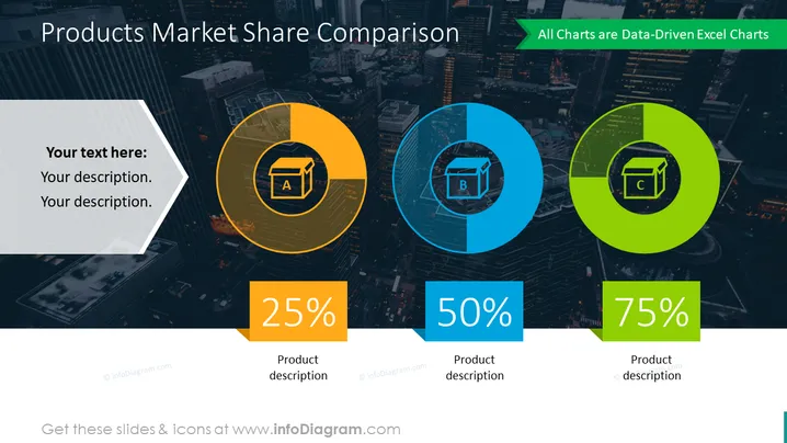
The slide is designed to present a comparison of market share for three products, labeled A, B, and C. Each product has a dedicated circle that is filled to a certain percentage representing its share of the market—25% for Product A, 50% for Product B, and 75% for Product C. These circles are not full pie charts but look like portions of circles that are colored in to denote the percentage of market share. Accompanying each graphical representation is a space for a textual product description, helping the audience understand what each product entails.
The slide is modern and visually striking, with bold color contrasts making the information stand out. The icons and color-coding are simple yet effective in conveying the information in a quick, digestible format.


