Your graphics add a nice touch to my presentations and I recently used them for one of my all-hands meetings. Your toolbox adds professionalism to my slides. Instead of using standard clipart.
Claude Jones, Director of Engineer, @Walmartlabs, USA
Your graphics add a nice touch to my presentations and I recently used them for one of my all-hands meetings. Your toolbox adds professionalism to my slides. Instead of using standard clipart.
Claude Jones, Director of Engineer, @Walmartlabs, USA
I needed a fresh look at some of my slides. I've tried to find a way to create a paintbrush effect, to underline, accentuate, add some color and the handwritten markers were just the things. Very easy to use, easy to size, change the color. It was an affordable, perfect solution and I'm happy to recommend it.
Anonymous, US
The crisp, clean look of the graphics, and the fact that it allowed me to easily edit and change the colors to match the template was my main reason for purchasing them.
Brandie Jenkins, E-learning Developer, USA
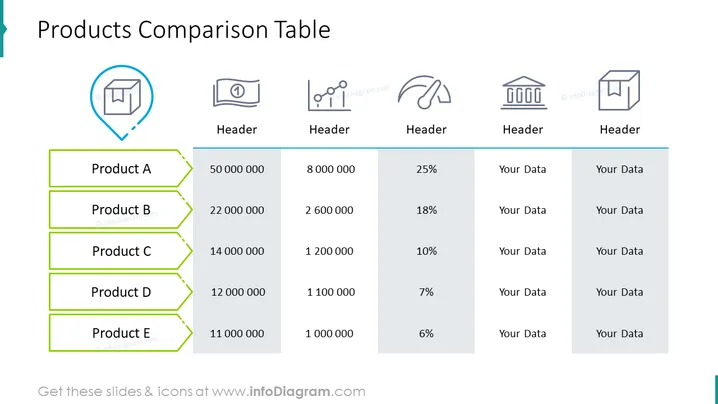
The slide presents a "Products Comparison Table" with five products, A to E. This table compares multiple data points across the products: numerical values which could represent sales, quantities, or other metrics, and two columns labeled "Your Data," suggesting customizable fields. Each product row implies a hierarchy, perhaps based on one of the numerical columns, such as revenue or units sold. It's a tool for side-by-side comparison of product performance or features.
The slide is minimalist with a clean, organized layout that facilitates easy comparison of data. The consistent use of green and gray along with the simple iconography conveys information efficiently without visual distractions.


