Your graphics add a nice touch to my presentations and I recently used them for one of my all-hands meetings. Your toolbox adds professionalism to my slides. Instead of using standard clipart.
Claude Jones, Director of Engineer, @Walmartlabs, USA
Your graphics add a nice touch to my presentations and I recently used them for one of my all-hands meetings. Your toolbox adds professionalism to my slides. Instead of using standard clipart.
Claude Jones, Director of Engineer, @Walmartlabs, USA
I needed a fresh look at some of my slides. I've tried to find a way to create a paintbrush effect, to underline, accentuate, add some color and the handwritten markers were just the things. Very easy to use, easy to size, change the color. It was an affordable, perfect solution and I'm happy to recommend it.
Anonymous, US
The crisp, clean look of the graphics, and the fact that it allowed me to easily edit and change the colors to match the template was my main reason for purchasing them.
Brandie Jenkins, E-learning Developer, USA
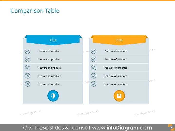
The slide presents a comparison table, directly comparing two sets of product features. Each side of the table has a banner with the word "Title" indicating that you can name each product or category being compared. Below the titles, there are alternating rows with ticks and crosses, symbolizing the presence or absence of specific features in a product. This setup allows the audience to easily discern the advantages or drawbacks of each product being evaluated.
The slide uses a clean and minimalistic design with a clear contrasting color scheme to differentiate between two sets of items. The use of icons and checkmarks/crosses allows for quick visual interpretation of comparative information.


