Your graphics add a nice touch to my presentations and I recently used them for one of my all-hands meetings. Your toolbox adds professionalism to my slides. Instead of using standard clipart.
Claude Jones, Director of Engineer, @Walmartlabs, USA
Your graphics add a nice touch to my presentations and I recently used them for one of my all-hands meetings. Your toolbox adds professionalism to my slides. Instead of using standard clipart.
Claude Jones, Director of Engineer, @Walmartlabs, USA
I needed a fresh look at some of my slides. I've tried to find a way to create a paintbrush effect, to underline, accentuate, add some color and the handwritten markers were just the things. Very easy to use, easy to size, change the color. It was an affordable, perfect solution and I'm happy to recommend it.
Anonymous, US
The crisp, clean look of the graphics, and the fact that it allowed me to easily edit and change the colors to match the template was my main reason for purchasing them.
Brandie Jenkins, E-learning Developer, USA
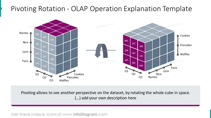
The slide titled "Pivoting Rotation - OLAP Operation Explanation Template" demonstrates the concept of pivoting rotation in the context of an OLAP (Online Analytical Processing) operation. It visually represents a 3D data cube before and after a pivoting action. Prior to the pivot, data is arranged by cities (Nantes, Nice, Lyon, Paris) along one axis, and product types (Cookies, Pancakes, Waffles) along another axis, with sales numbers for Q1, Q2, and Q3 shown on the cube's faces. Post-pivoting, the cube's orientation has changed to show the product types as the primary axis, allowing a different perspective on the dataset, which can be helpful in analyzing data from different angles.
The slide features a clean and professional design with a clear visual contrast between the 'before' and 'after' states of the data cube. It effectively uses color coding and positioning to articulate the concept of pivoting within an OLAP system.


