Your graphics add a nice touch to my presentations and I recently used them for one of my all-hands meetings. Your toolbox adds professionalism to my slides. Instead of using standard clipart.
Claude Jones, Director of Engineer, @Walmartlabs, USA
Your graphics add a nice touch to my presentations and I recently used them for one of my all-hands meetings. Your toolbox adds professionalism to my slides. Instead of using standard clipart.
Claude Jones, Director of Engineer, @Walmartlabs, USA
I needed a fresh look at some of my slides. I've tried to find a way to create a paintbrush effect, to underline, accentuate, add some color and the handwritten markers were just the things. Very easy to use, easy to size, change the color. It was an affordable, perfect solution and I'm happy to recommend it.
Anonymous, US
The crisp, clean look of the graphics, and the fact that it allowed me to easily edit and change the colors to match the template was my main reason for purchasing them.
Brandie Jenkins, E-learning Developer, USA
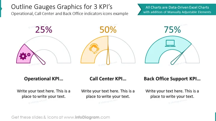
The slide visually represents three different Key Performance Indicators (KPIs) for Operational, Call Center, and Back Office Support using gauge graphics. Each gauge is accompanied by an icon representing its respective area: a set of gears for Operational, a headset for Call Center, and a computer for Back Office Support. Each gauge shows a percentage that indicates the level of achievement or performance, with labeled spaces below to add descriptive text about each KPI. This structured layout can succinctly convey performance metrics and areas for narrative expansion.
The slide has a professional and clean design with a balanced mix of text, icons, and data visualization that caters to a business-oriented audience. The use of color-coding and icons provides a quick visual reference to distinguish between different metrics.


