Your graphics add a nice touch to my presentations and I recently used them for one of my all-hands meetings. Your toolbox adds professionalism to my slides. Instead of using standard clipart.
Claude Jones, Director of Engineer, @Walmartlabs, USA
Your graphics add a nice touch to my presentations and I recently used them for one of my all-hands meetings. Your toolbox adds professionalism to my slides. Instead of using standard clipart.
Claude Jones, Director of Engineer, @Walmartlabs, USA
I needed a fresh look at some of my slides. I've tried to find a way to create a paintbrush effect, to underline, accentuate, add some color and the handwritten markers were just the things. Very easy to use, easy to size, change the color. It was an affordable, perfect solution and I'm happy to recommend it.
Anonymous, US
The crisp, clean look of the graphics, and the fact that it allowed me to easily edit and change the colors to match the template was my main reason for purchasing them.
Brandie Jenkins, E-learning Developer, USA
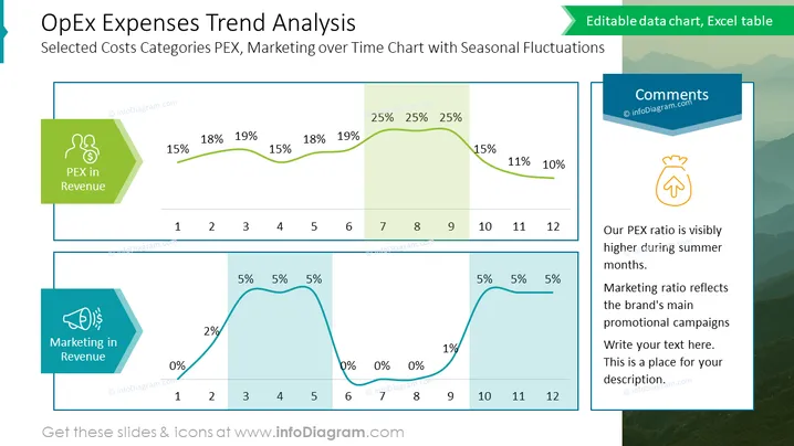
The slide presents a trend analysis of Operational Expenditures (OpEx) with a focus on selected cost categories such as PEX and Marketing over a 12-month period showcasing seasonal fluctuations. Two line graphs highlight the percentage of PEX and Marketing in revenue with strategic points throughout the year indicating higher percentages during certain months. For instance, PEX expenditure rises in months 4-6, while Marketing expenditure peaks around months 7-9. A comment box suggests that PEX ratio is higher in the summer months and that the Marketing ratio aligns with main promotional campaigns.
The slide has a professional aesthetic with a clear color scheme that aids in distinguishing between the different data sets. The combination of icons, color-coded charts, and the commentary section makes the slide both informative and visually engaging.


