Your graphics add a nice touch to my presentations and I recently used them for one of my all-hands meetings. Your toolbox adds professionalism to my slides. Instead of using standard clipart.
Claude Jones, Director of Engineer, @Walmartlabs, USA
Your graphics add a nice touch to my presentations and I recently used them for one of my all-hands meetings. Your toolbox adds professionalism to my slides. Instead of using standard clipart.
Claude Jones, Director of Engineer, @Walmartlabs, USA
I needed a fresh look at some of my slides. I've tried to find a way to create a paintbrush effect, to underline, accentuate, add some color and the handwritten markers were just the things. Very easy to use, easy to size, change the color. It was an affordable, perfect solution and I'm happy to recommend it.
Anonymous, US
The crisp, clean look of the graphics, and the fact that it allowed me to easily edit and change the colors to match the template was my main reason for purchasing them.
Brandie Jenkins, E-learning Developer, USA
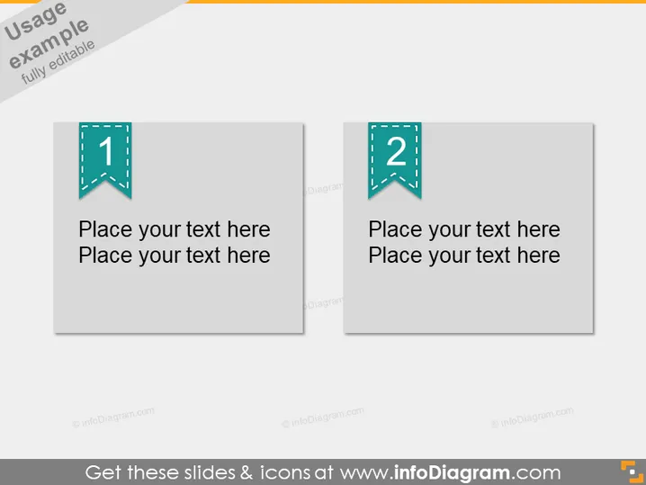
The PowerPoint slide shows a two-part comparison template, which is ideal for contrasting two ideas, concepts, or groups of information. Each section has a prominent numerical marker, with '1' on the left and '2' on the right, suggesting a step-by-step or comparative format. The template prompts users to "Place your text here," indicating a customizable layout for personalized content. Explaining further, these markers help to guide the audience through the content sequentially or draw attention to parallel elements in a presentation.
The overall look is clean and structured, with a professional color palette that can fit a variety of presentation contexts. The use of space and shadowing provides a sense of depth without detracting from the content focus.


