Your graphics add a nice touch to my presentations and I recently used them for one of my all-hands meetings. Your toolbox adds professionalism to my slides. Instead of using standard clipart.
Claude Jones, Director of Engineer, @Walmartlabs, USA
Your graphics add a nice touch to my presentations and I recently used them for one of my all-hands meetings. Your toolbox adds professionalism to my slides. Instead of using standard clipart.
Claude Jones, Director of Engineer, @Walmartlabs, USA
I needed a fresh look at some of my slides. I've tried to find a way to create a paintbrush effect, to underline, accentuate, add some color and the handwritten markers were just the things. Very easy to use, easy to size, change the color. It was an affordable, perfect solution and I'm happy to recommend it.
Anonymous, US
The crisp, clean look of the graphics, and the fact that it allowed me to easily edit and change the colors to match the template was my main reason for purchasing them.
Brandie Jenkins, E-learning Developer, USA
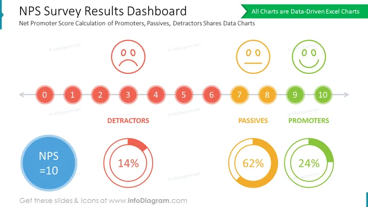
This PowerPoint slide provides a visual representation of Net Promoter Score (NPS) survey results, a key metric for gauging customer loyalty and satisfaction. The slide effectively summarizes the distribution of respondents across three categories: Promoters, Passives, and Detractors. It also highlights the overall NPS score, offering valuable insights into customer sentiment and potential areas for improvement. This infographic-style slide can be incorporated into various business presentations, including: customer experience (CX) presentations: To showcase the impact of CX initiatives on customer loyalty and NPS trends; marketing presentations: To demonstrate the effectiveness of marketing campaigns in driving customer satisfaction and positive word-of-mouth; sales presentations: To highlight the company's commitment to customer satisfaction and the value proposition that leads to high NPS scores.


