Your graphics add a nice touch to my presentations and I recently used them for one of my all-hands meetings. Your toolbox adds professionalism to my slides. Instead of using standard clipart.
Claude Jones, Director of Engineer, @Walmartlabs, USA
Your graphics add a nice touch to my presentations and I recently used them for one of my all-hands meetings. Your toolbox adds professionalism to my slides. Instead of using standard clipart.
Claude Jones, Director of Engineer, @Walmartlabs, USA
I needed a fresh look at some of my slides. I've tried to find a way to create a paintbrush effect, to underline, accentuate, add some color and the handwritten markers were just the things. Very easy to use, easy to size, change the color. It was an affordable, perfect solution and I'm happy to recommend it.
Anonymous, US
The crisp, clean look of the graphics, and the fact that it allowed me to easily edit and change the colors to match the template was my main reason for purchasing them.
Brandie Jenkins, E-learning Developer, USA
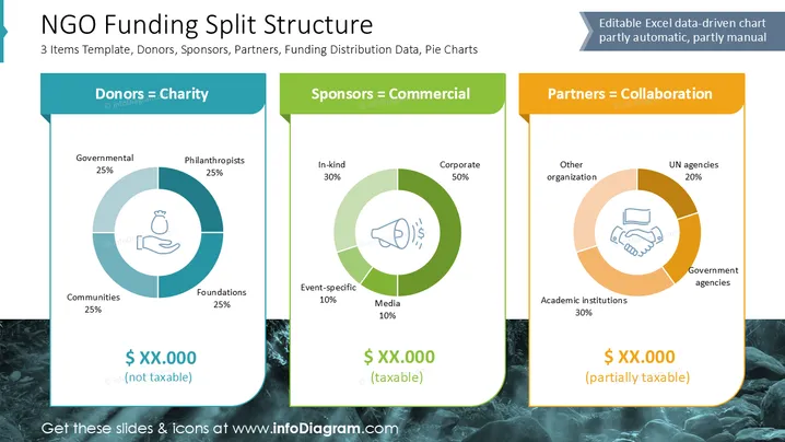
This slide presents the "NGO Funding Split Structure" highlighting funding sources: Donors as Charity, Sponsors as Commercial, and Partners as Collaboration. It uses pie charts to show distribution: Donors consist of Governmental (25%), Communities (25%), Philanthropists (25%), and Foundations (25%). Sponsors include Corporate (50%), In-kind (30%), Event-specific (10%), and Media (10%). Partners include Government agencies (30%), Academic institutions (30%), UN agencies (20%), and Other organizations (20%). Funding types are categorized as not taxable, taxable, or partially taxable.
The overall look is professional and organized, using visual cues to distinguish between different sources and partners effectively. The use of colors assists in quick information absorption.


