

Your graphics add a nice touch to my presentations and I recently used them for one of my all-hands meetings. Your toolbox adds professionalism to my slides. Instead of using standard clipart.
Claude Jones, Director of Engineer, @Walmartlabs, USA

Your graphics add a nice touch to my presentations and I recently used them for one of my all-hands meetings. Your toolbox adds professionalism to my slides. Instead of using standard clipart.
Claude Jones, Director of Engineer, @Walmartlabs, USA
I needed a fresh look at some of my slides. I've tried to find a way to create a paintbrush effect, to underline, accentuate, add some color and the handwritten markers were just the things. Very easy to use, easy to size, change the color. It was an affordable, perfect solution and I'm happy to recommend it.
Anonymous, US
The crisp, clean look of the graphics, and the fact that it allowed me to easily edit and change the colors to match the template was my main reason for purchasing them.
Brandie Jenkins, E-learning Developer, USA
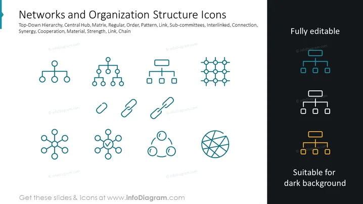
The slide presents a collection of icons related to organizational structure and networking. Each icon symbolizes a different concept: the top-down hierarchy showcases a typical corporate structure; the central hub symbolizes a node with connections spreading outwards representing centralized networks; the matrix icon represents interconnected nodes in a grid-like structure, signifying interdepartmental relationships; regular, order, and pattern icons establish a sense of structured process; link shows connections or relationships; sub-committees represent smaller working groups within a larger organization; interlinked suggests multiple interconnected elements; connection implies a relationship or a point where two or more things join; synergy indicates cooperative interaction; cooperation is about working together; material could symbolize resources; strength signifies robustness; link emphasizes connections again; and chain represents a series of interconnected elements.
The overall look of the slide is modern and clean, with a clear division between light and dark backgrounds showcasing the adaptability of the icons. The icons are minimalistic, emphasizing their application in representing different organizational or networking concepts without unnecessary detail or clutter.



