Your graphics add a nice touch to my presentations and I recently used them for one of my all-hands meetings. Your toolbox adds professionalism to my slides. Instead of using standard clipart.
Claude Jones, Director of Engineer, @Walmartlabs, USA
Your graphics add a nice touch to my presentations and I recently used them for one of my all-hands meetings. Your toolbox adds professionalism to my slides. Instead of using standard clipart.
Claude Jones, Director of Engineer, @Walmartlabs, USA
I needed a fresh look at some of my slides. I've tried to find a way to create a paintbrush effect, to underline, accentuate, add some color and the handwritten markers were just the things. Very easy to use, easy to size, change the color. It was an affordable, perfect solution and I'm happy to recommend it.
Anonymous, US
The crisp, clean look of the graphics, and the fact that it allowed me to easily edit and change the colors to match the template was my main reason for purchasing them.
Brandie Jenkins, E-learning Developer, USA
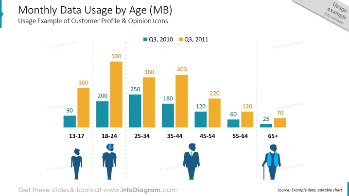
The slide titled "Monthly Data Usage by Age (MB)" demonstrates a comparison of mobile data consumption across different age groups, using two different periods for comparison (Q3, 2010 and Q3, 2011). Each age group is represented by a pair of bars showing data usage, with the younger age groups generally using more data. The age groups are 13-17, 18-24, 25-34, 35-44, 45-54, 55-64 and 65+ years. Data usage figures given range from 90MB for the 13-17 age group in Q3, 2010 to 500MB for the 25-34 age group in Q3, 2011.
The slide blends a clean design with an informative chart, using contrasting colors to clearly distinguish between the two datasets. It's visually balanced, with a title at the top and icons at the bottom to assist in visual interpretation of the data.
The slide presents data comparing mobile data usage measured in megabytes across various age groups (13-17, 18-24, 25-34, 35-44, 45-54, 55-64, 65+) over two quarters, Q3 2010 and Q3 2011. The data suggests that younger generations have higher data usage, with the 25-34 age group reaching up to 500 MB. The usage decreases with increasing age, indicating a potential trend in data consumption habits.
The slide utilizes a clean and professional design, with a clear focus on the data presented in the bar chart. The use of color effectively differentiates between the two time periods, while the icons aid in associating data with demographic groups.
The "Monthly Data Usage by Age (MB)" slide displays a colorful bar chart comparing mobile data usage among different age groups for two time periods, Q3 2010 and Q3 2011. It clearly shows that the 25-34 age group has the highest data consumption, while the oldest age group, 65+, has the lowest. This visual representation highlights the differences in data usage habits across age demographics, which could have implications for market targeting and product development.
The slide is well-structured, visually clean, and professional. The use of icons and color-coding makes the data easily interpretable, while the titled bar chart conveys the core message effectively.


