Monthly Data Usage by Age (MB)
Slide Content
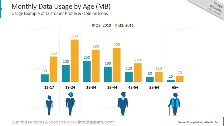
The slide titled "Monthly Data Usage by Age (MB)" demonstrates a comparison of mobile data consumption across different age groups, using two different periods for comparison (Q3, 2010 and Q3, 2011). Each age group is represented by a pair of bars showing data usage, with the younger age groups generally using more data. The age groups are 13-17, 18-24, 25-34, 35-44, 45-54, 55-64 and 65+ years. Data usage figures given range from 90MB for the 13-17 age group in Q3, 2010 to 500MB for the 25-34 age group in Q3, 2011.
Graphical Look
- The slide has a light background with a prominent chart in the center.
- A two-tone color scheme represents different years: teal for Q3, 2010 and orange for Q3, 2011.
- The bar chart includes seven pairs of vertical bars, each pair corresponding to an age group.
- The age groups are listed at the bottom of the chart, with icons representing different gender and age demographics.
- The x-axis of the chart represents age groups, while the y-axis represents data usage in megabytes (MB).
- The y-axis is marked with horizontal grid lines for reference.
- Above the chart, the title of the slide is displayed in large, bold text.
- Below the chart, a legend explains the color coding for the two years compared.
- The source of the data is cited at the bottom right of the slide as "Example data, editable chart."
The slide blends a clean design with an informative chart, using contrasting colors to clearly distinguish between the two datasets. It's visually balanced, with a title at the top and icons at the bottom to assist in visual interpretation of the data.
Use Cases
Monthly Data Usage by Age (MB)
Slide Content
The slide presents data comparing mobile data usage measured in megabytes across various age groups (13-17, 18-24, 25-34, 35-44, 45-54, 55-64, 65+) over two quarters, Q3 2010 and Q3 2011. The data suggests that younger generations have higher data usage, with the 25-34 age group reaching up to 500 MB. The usage decreases with increasing age, indicating a potential trend in data consumption habits.
Graphical Look
- The background of the slide is white with blue accents on the left side and top right corner.
- The title of the slide is prominently featured at the top in large, bold, blue text.
- The bar chart occupies the central portion of the slide, with the vertical axis labeled in increments of 100 MB up to 500 MB.
- Each age group is denoted by a pair of bars that differ in color: teal for Q3 2010 and orange for Q3 2011.
- There are icons representing different genders below the age group categories, adding a visual demographic element.
- Each bar is clearly labeled with the respective data usage figure at the top.
- The legend for the colors representing Q3 2010 and Q3 2011 is situated above the chart, aligned with the center.
- The source of the data is indicated at the bottom right, near the last set of age group icons.
The slide utilizes a clean and professional design, with a clear focus on the data presented in the bar chart. The use of color effectively differentiates between the two time periods, while the icons aid in associating data with demographic groups.
Use Cases
- Analyzing consumer behavior across different demographics in marketing presentations.
- Presenting research findings on technology usage trends in an academic or professional setting.
- Providing insights into market segments for business ## Monthly Data Usage by Age (MB)
Slide Content
The "Monthly Data Usage by Age (MB)" slide displays a colorful bar chart comparing mobile data usage among different age groups for two time periods, Q3 2010 and Q3 2011. It clearly shows that the 25-34 age group has the highest data consumption, while the oldest age group, 65+, has the lowest. This visual representation highlights the differences in data usage habits across age demographics, which could have implications for market targeting and product development.
Graphical Look
- The slide has a white background, with a main focal bar chart.
- The chart contrasts two colors, teal and orange, to represent data from Q3, 2010 and Q3, 2011 respectively.
- Bar heights vary, showing the comparative amounts of data usage with values labeled on top of each bar.
- Age range categories are listed below the chart, with silhouette icons indicating different demographic segments.
- The y-axis is marked with a scale in increments of 100, up to 500 MB.
- Title and subtitle texts are located at the top in dark blue, with the subtitle offering additional context regarding icons.
- A legend above the chart explains the color coding, using small squares matching the bar colors.
- Source attribution is given at the bottom right, maintaining the slide's professional tone.
The slide is well-structured, visually clean, and professional. The use of icons and color-coding makes the data easily interpretable, while the titled bar chart conveys the core message effectively.
Use Cases
- To illustrate demographic data usage trends in telecommunications industry meetings.
- For marketing analysis presentations identifying target audiences based on technology consumption patterns.
- To support strategic business planning with insights into customer behavior for product or service development.
- In educational settings, for discussions on generational differences in digital consumption habits.