Your graphics add a nice touch to my presentations and I recently used them for one of my all-hands meetings. Your toolbox adds professionalism to my slides. Instead of using standard clipart.
Claude Jones, Director of Engineer, @Walmartlabs, USA
Your graphics add a nice touch to my presentations and I recently used them for one of my all-hands meetings. Your toolbox adds professionalism to my slides. Instead of using standard clipart.
Claude Jones, Director of Engineer, @Walmartlabs, USA
I needed a fresh look at some of my slides. I've tried to find a way to create a paintbrush effect, to underline, accentuate, add some color and the handwritten markers were just the things. Very easy to use, easy to size, change the color. It was an affordable, perfect solution and I'm happy to recommend it.
Anonymous, US
The crisp, clean look of the graphics, and the fact that it allowed me to easily edit and change the colors to match the template was my main reason for purchasing them.
Brandie Jenkins, E-learning Developer, USA
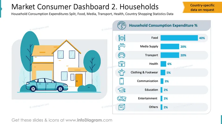
The slide showcases household consumption expenditure percentages across various categories. Food accounts for 40% of spending, indicating the largest share allocated for sustenance and groceries. Media supply and transport each take up 20%, reflecting essential communication and mobility needs. Health expenses are at 6%, covering medical-related costs. Clothing & footwear add up to 5%, highlighting apparel and footwear purchases. Communication (3%), education (2%), entertainment (2%), and others (2%) constitute smaller spending areas, emphasizing ancillary expenditures.
The slide is visually structured with balance and clarity, emphasizing key data points through a combination of text and simple icons, ensuring easy comprehension.


