Your graphics add a nice touch to my presentations and I recently used them for one of my all-hands meetings. Your toolbox adds professionalism to my slides. Instead of using standard clipart.
Claude Jones, Director of Engineer, @Walmartlabs, USA
Your graphics add a nice touch to my presentations and I recently used them for one of my all-hands meetings. Your toolbox adds professionalism to my slides. Instead of using standard clipart.
Claude Jones, Director of Engineer, @Walmartlabs, USA
I needed a fresh look at some of my slides. I've tried to find a way to create a paintbrush effect, to underline, accentuate, add some color and the handwritten markers were just the things. Very easy to use, easy to size, change the color. It was an affordable, perfect solution and I'm happy to recommend it.
Anonymous, US
The crisp, clean look of the graphics, and the fact that it allowed me to easily edit and change the colors to match the template was my main reason for purchasing them.
Brandie Jenkins, E-learning Developer, USA
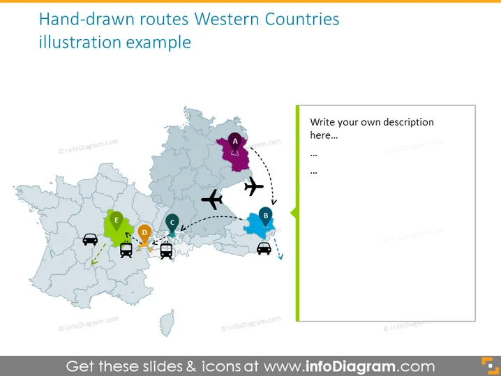
This PowerPoint slide illustrates a conceptual map of Western countries with hand-drawn routes marking the travel or distribution paths between different points labeled from A to E. Point A is marked with a purple pin and seems to denote the starting point. Points B through E are marked with other colored pins, with transportation icons like planes and cars suggesting the movement between these points. The map appears to be representative rather than strictly geographically accurate, providing a versatile tool for visualizing routes or networks.
The overall look is clean and visually engaging, with a balance of graphics and space for text. The colors and icons are used effectively to guide the viewer's attention through the visualized routes.


