Your graphics add a nice touch to my presentations and I recently used them for one of my all-hands meetings. Your toolbox adds professionalism to my slides. Instead of using standard clipart.
Claude Jones, Director of Engineer, @Walmartlabs, USA
Your graphics add a nice touch to my presentations and I recently used them for one of my all-hands meetings. Your toolbox adds professionalism to my slides. Instead of using standard clipart.
Claude Jones, Director of Engineer, @Walmartlabs, USA
I needed a fresh look at some of my slides. I've tried to find a way to create a paintbrush effect, to underline, accentuate, add some color and the handwritten markers were just the things. Very easy to use, easy to size, change the color. It was an affordable, perfect solution and I'm happy to recommend it.
Anonymous, US
The crisp, clean look of the graphics, and the fact that it allowed me to easily edit and change the colors to match the template was my main reason for purchasing them.
Brandie Jenkins, E-learning Developer, USA
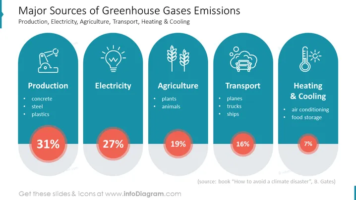
The slide presents a breakdown of the major sources of greenhouse gas emissions, divided into four categories: Production, Electricity, Agriculture, and Heating & Cooling. Each category features a percentage share of emissions and specific examples: Production (31%) includes concrete, steel, and plastics; Electricity (27%) does not specify sources; Agriculture (19%) involves emissions from plants and animals; and Heating & Cooling (7%) covers air conditioning and food storage processes. These categories help in understanding where efforts can be concentrated to reduce greenhouse gas emissions.
The overall look is modern and clean with a consistent iconographic style that visually categorizes the information. The use of color and graphics effectively highlights the key information and allows for quick understanding at a glance.


