Your graphics add a nice touch to my presentations and I recently used them for one of my all-hands meetings. Your toolbox adds professionalism to my slides. Instead of using standard clipart.
Claude Jones, Director of Engineer, @Walmartlabs, USA
Your graphics add a nice touch to my presentations and I recently used them for one of my all-hands meetings. Your toolbox adds professionalism to my slides. Instead of using standard clipart.
Claude Jones, Director of Engineer, @Walmartlabs, USA
I needed a fresh look at some of my slides. I've tried to find a way to create a paintbrush effect, to underline, accentuate, add some color and the handwritten markers were just the things. Very easy to use, easy to size, change the color. It was an affordable, perfect solution and I'm happy to recommend it.
Anonymous, US
The crisp, clean look of the graphics, and the fact that it allowed me to easily edit and change the colors to match the template was my main reason for purchasing them.
Brandie Jenkins, E-learning Developer, USA
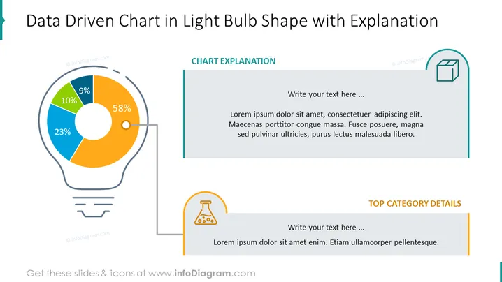
The PowerPoint slide presents a unique pie chart in the shape of a light bulb, with segments indicating different percentages: 58%, 23%, 10%, and 9%. This creative design concept is used to depict data in an engaging manner. The chart is accompanied by placeholders for a chart explanation on the right top corner and for specific top category details at the bottom right. Each placeholder encourages the presenter to elaborate on the data and insights derived from the chart.
The slide exhibits a modern and professional appearance with a creative twist on data visualization. The light bulb pie chart as a metaphor for ideas or innovation is visually striking and effectively draws attention to the data.


