Your graphics add a nice touch to my presentations and I recently used them for one of my all-hands meetings. Your toolbox adds professionalism to my slides. Instead of using standard clipart.
Claude Jones, Director of Engineer, @Walmartlabs, USA
Your graphics add a nice touch to my presentations and I recently used them for one of my all-hands meetings. Your toolbox adds professionalism to my slides. Instead of using standard clipart.
Claude Jones, Director of Engineer, @Walmartlabs, USA
I needed a fresh look at some of my slides. I've tried to find a way to create a paintbrush effect, to underline, accentuate, add some color and the handwritten markers were just the things. Very easy to use, easy to size, change the color. It was an affordable, perfect solution and I'm happy to recommend it.
Anonymous, US
The crisp, clean look of the graphics, and the fact that it allowed me to easily edit and change the colors to match the template was my main reason for purchasing them.
Brandie Jenkins, E-learning Developer, USA
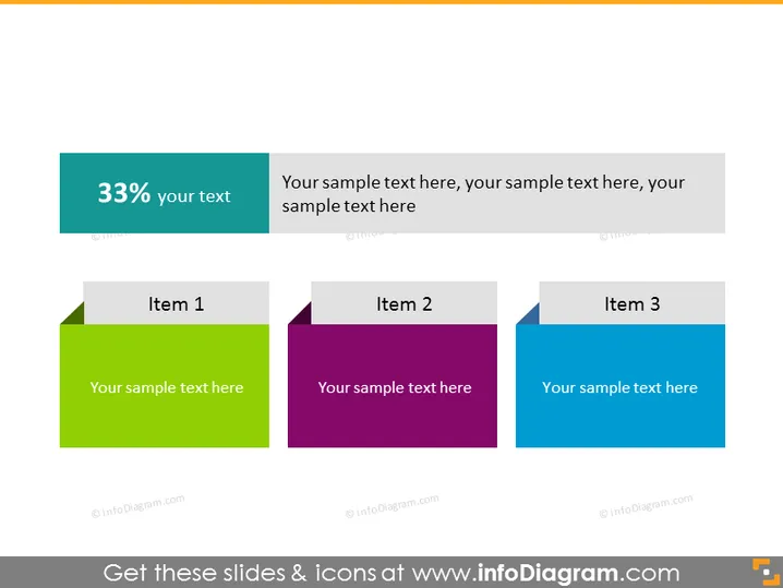
This PowerPoint slide appears to be conveying statistics or progress with a heading that indicates a percentage, "33% your text". It breaks down information or steps into three items, suggesting a sequence or categories. 'Item 1' might refer to the initial part or phase of a process, 'Item 2' might indicate a subsequent stage with a different focus, and 'Item 3' could represent the final segment or an additional aspect central to the overall information being presented.
The slide's overall look is clean and organized, with a color-coded system that supports easy distinction between the items. The lack of clutter and simple color palette makes the slide visually appealing and straightforward to follow.


