Your graphics add a nice touch to my presentations and I recently used them for one of my all-hands meetings. Your toolbox adds professionalism to my slides. Instead of using standard clipart.
Claude Jones, Director of Engineer, @Walmartlabs, USA
Your graphics add a nice touch to my presentations and I recently used them for one of my all-hands meetings. Your toolbox adds professionalism to my slides. Instead of using standard clipart.
Claude Jones, Director of Engineer, @Walmartlabs, USA
I needed a fresh look at some of my slides. I've tried to find a way to create a paintbrush effect, to underline, accentuate, add some color and the handwritten markers were just the things. Very easy to use, easy to size, change the color. It was an affordable, perfect solution and I'm happy to recommend it.
Anonymous, US
The crisp, clean look of the graphics, and the fact that it allowed me to easily edit and change the colors to match the template was my main reason for purchasing them.
Brandie Jenkins, E-learning Developer, USA
N/A (The image provided does not contain a clear slide title to transcribe.)
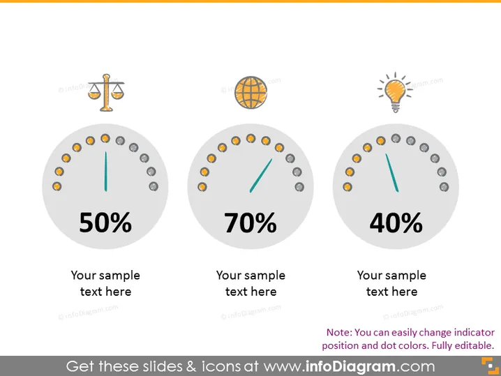
The slide presents three circular gauges displaying percentages: 50%, 70%, and 40%. Each gauge is associated with an icon and placeholder text for further description. The 50% gauge is linked with a balance scale icon, typically representing justice or balance. The 70% gauge's global icon suggests international or environmental themes. Lastly, the 40% gauge has a lightbulb icon, commonly used to denote ideas, innovation, or energy-related concepts. The note at the bottom indicates that indicator positions and colors are customizable.
The overall look is modern and minimalist, with a professional color scheme suitable for a business or educational presentation. The gauges and icons are simple and clear, making the data instantly recognizable.


