Your graphics add a nice touch to my presentations and I recently used them for one of my all-hands meetings. Your toolbox adds professionalism to my slides. Instead of using standard clipart.
Claude Jones, Director of Engineer, @Walmartlabs, USA
Your graphics add a nice touch to my presentations and I recently used them for one of my all-hands meetings. Your toolbox adds professionalism to my slides. Instead of using standard clipart.
Claude Jones, Director of Engineer, @Walmartlabs, USA
I needed a fresh look at some of my slides. I've tried to find a way to create a paintbrush effect, to underline, accentuate, add some color and the handwritten markers were just the things. Very easy to use, easy to size, change the color. It was an affordable, perfect solution and I'm happy to recommend it.
Anonymous, US
The crisp, clean look of the graphics, and the fact that it allowed me to easily edit and change the colors to match the template was my main reason for purchasing them.
Brandie Jenkins, E-learning Developer, USA
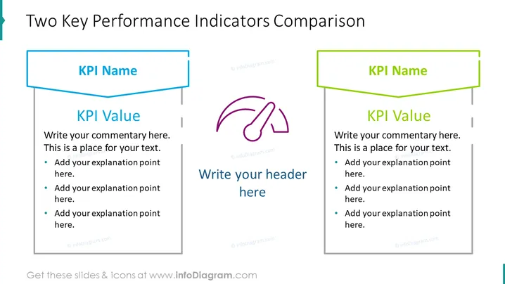
The slide presents a template for comparing two Key Performance Indicators (KPIs). Each KPI has a designated box with space for a 'KPI Name' at the top and a 'KPI Value' below, followed by bullet points where explanations or commentary can be added. The content suggests that each KPI can be elaborated by adding explanation points which could help in understanding the significance or the context behind the KPIs.
The overall look of the slide is clean and professional, with a clear distinction between the two KPIs for easy comparison. The use of color, icons, and text placeholders makes it visually engaging and user-friendly.


