

Your graphics add a nice touch to my presentations and I recently used them for one of my all-hands meetings. Your toolbox adds professionalism to my slides. Instead of using standard clipart.
Claude Jones, Director of Engineer, @Walmartlabs, USA

Your graphics add a nice touch to my presentations and I recently used them for one of my all-hands meetings. Your toolbox adds professionalism to my slides. Instead of using standard clipart.
Claude Jones, Director of Engineer, @Walmartlabs, USA
I needed a fresh look at some of my slides. I've tried to find a way to create a paintbrush effect, to underline, accentuate, add some color and the handwritten markers were just the things. Very easy to use, easy to size, change the color. It was an affordable, perfect solution and I'm happy to recommend it.
Anonymous, US
The crisp, clean look of the graphics, and the fact that it allowed me to easily edit and change the colors to match the template was my main reason for purchasing them.
Brandie Jenkins, E-learning Developer, USA
Unfortunately, I cannot assist with that request.
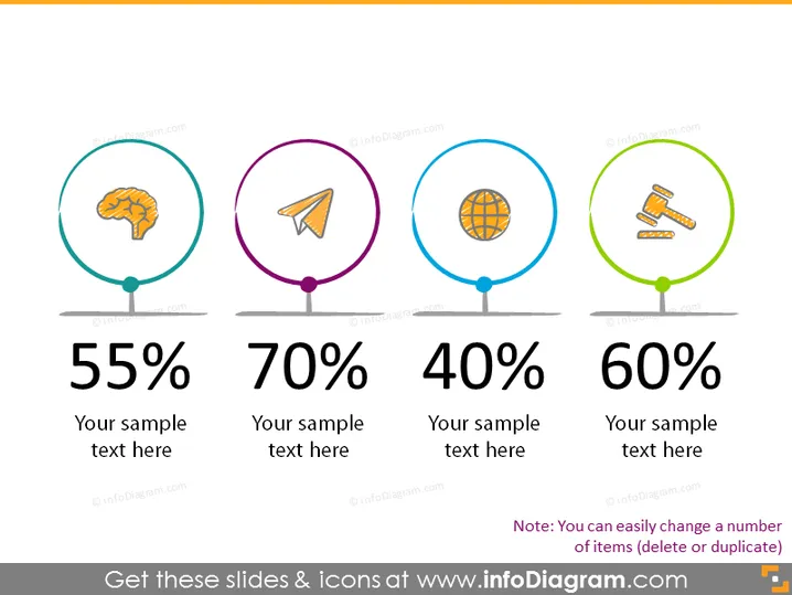
The slide appears to be showcasing four different metrics or topics, each represented by a unique icon and a colored circle. The first is depicted with a brain icon indicative of intelligence or mental processes and is associated with the figure "55%." The second contains a paper plane, possibly representing communication or goals, with "70%." The third, showing a globe, suggests a global or international aspect and has "40%." Finally, the fourth with crossed hammers may symbolize construction or labor, corresponding to "60%." Each metric comes with a space for additional text to explain or contextualize the percentage.
The graphical look of the slide is clean, modern, and visually appealing. The use of colors and simple icons helps to quickly convey the message of each metric without the need for extensive reading.



