Your graphics add a nice touch to my presentations and I recently used them for one of my all-hands meetings. Your toolbox adds professionalism to my slides. Instead of using standard clipart.
Claude Jones, Director of Engineer, @Walmartlabs, USA
Your graphics add a nice touch to my presentations and I recently used them for one of my all-hands meetings. Your toolbox adds professionalism to my slides. Instead of using standard clipart.
Claude Jones, Director of Engineer, @Walmartlabs, USA
I needed a fresh look at some of my slides. I've tried to find a way to create a paintbrush effect, to underline, accentuate, add some color and the handwritten markers were just the things. Very easy to use, easy to size, change the color. It was an affordable, perfect solution and I'm happy to recommend it.
Anonymous, US
The crisp, clean look of the graphics, and the fact that it allowed me to easily edit and change the colors to match the template was my main reason for purchasing them.
Brandie Jenkins, E-learning Developer, USA
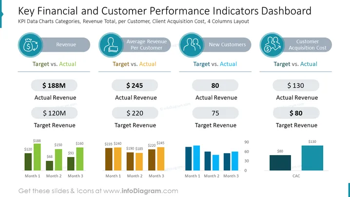
The slide shows a dashboard for analyzing key performance indicators (KPIs) related to finances and customer metrics. It is divided into four categories: Revenue, Average Revenue Per Customer, New Customers, and Customer Acquisition Cost. Each category includes a 'Target vs. Actual' comparison. Revenue shows an actual of $188M against a $120M target. Average Revenue Per Customer presents $245 actual vs. a $220 target. The New Customers' segment details 80 actual new customers compared to a target of 75. Lastly, Customer Acquisition Cost shows $130 actual vs. an $80 target. Each category comes with a three-month trend chart, displaying monthly performance in relation to targets.
The slide is visually balanced with a clean and professional design, utilizing a consistent color palette and clear typography to convey complex data effectively. It is designed to provide a quick, at-a-glance comparison of company performance metrics against established targets.


