Your graphics add a nice touch to my presentations and I recently used them for one of my all-hands meetings. Your toolbox adds professionalism to my slides. Instead of using standard clipart.
Claude Jones, Director of Engineer, @Walmartlabs, USA
Your graphics add a nice touch to my presentations and I recently used them for one of my all-hands meetings. Your toolbox adds professionalism to my slides. Instead of using standard clipart.
Claude Jones, Director of Engineer, @Walmartlabs, USA
I needed a fresh look at some of my slides. I've tried to find a way to create a paintbrush effect, to underline, accentuate, add some color and the handwritten markers were just the things. Very easy to use, easy to size, change the color. It was an affordable, perfect solution and I'm happy to recommend it.
Anonymous, US
The crisp, clean look of the graphics, and the fact that it allowed me to easily edit and change the colors to match the template was my main reason for purchasing them.
Brandie Jenkins, E-learning Developer, USA
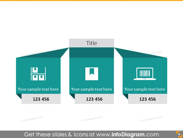
The PowerPoint slide presented is a three-section comparison chart designed to describe different elements or ideas. Each section includes an icon that represents the concept being discussed. For instance, the icon of bars could symbolize growth or statistics, a square within a square may represent layers or structure, and the laptop icon might denote technology or computing. Each section has a placeholder text "Your sample text here" followed by a number sequence "123 456", which indicates where specific descriptions or data should be inserted.
The overall visual aesthetic is sleek and modern, with a professional look conferred by the consistent color palette and clean graphics. The use of geometric shapes and icons gives the slide a structured, organized feel.


