Your graphics add a nice touch to my presentations and I recently used them for one of my all-hands meetings. Your toolbox adds professionalism to my slides. Instead of using standard clipart.
Claude Jones, Director of Engineer, @Walmartlabs, USA
Your graphics add a nice touch to my presentations and I recently used them for one of my all-hands meetings. Your toolbox adds professionalism to my slides. Instead of using standard clipart.
Claude Jones, Director of Engineer, @Walmartlabs, USA
I needed a fresh look at some of my slides. I've tried to find a way to create a paintbrush effect, to underline, accentuate, add some color and the handwritten markers were just the things. Very easy to use, easy to size, change the color. It was an affordable, perfect solution and I'm happy to recommend it.
Anonymous, US
The crisp, clean look of the graphics, and the fact that it allowed me to easily edit and change the colors to match the template was my main reason for purchasing them.
Brandie Jenkins, E-learning Developer, USA
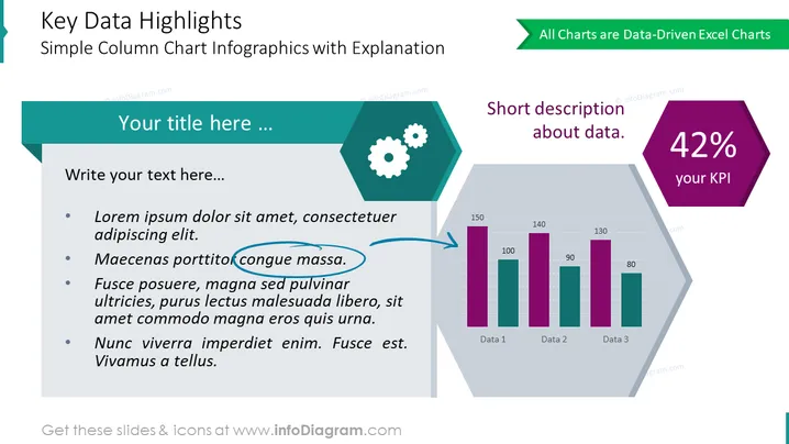
##Key Data Highlights Illustrated With Simple Column Chart Template
This is a universal slide for highlighting the critical data in any chart. Place your diagram in the hexagonal shape on the right and put the crucial metric above. Add a description if needed. Use the spacious text container on the left to explain in detail the meaning of this critical number.
##What Does This Key Data Highlights Illustrated With Simple Column Chart Template Include?
This Key Data Highlights Illustrated With Simple Column Chart Template is a part of our Bar and Column Chart Data-driven Graphics PPT Template.


