Your graphics add a nice touch to my presentations and I recently used them for one of my all-hands meetings. Your toolbox adds professionalism to my slides. Instead of using standard clipart.
Claude Jones, Director of Engineer, @Walmartlabs, USA
Your graphics add a nice touch to my presentations and I recently used them for one of my all-hands meetings. Your toolbox adds professionalism to my slides. Instead of using standard clipart.
Claude Jones, Director of Engineer, @Walmartlabs, USA
I needed a fresh look at some of my slides. I've tried to find a way to create a paintbrush effect, to underline, accentuate, add some color and the handwritten markers were just the things. Very easy to use, easy to size, change the color. It was an affordable, perfect solution and I'm happy to recommend it.
Anonymous, US
The crisp, clean look of the graphics, and the fact that it allowed me to easily edit and change the colors to match the template was my main reason for purchasing them.
Brandie Jenkins, E-learning Developer, USA
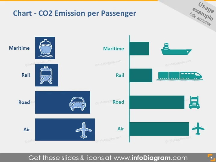
The PowerPoint slide conveys information about the CO2 emissions per passenger associated with different modes of transport: maritime, rail, road, and air. The larger the bar in the graphical representation, the higher the emissions attributed to the respective mode. Maritime has the smallest emission value, signifying it's the most eco-friendly choice for passenger travel in terms of CO2 output. On the other hand, Air travel shows the largest bar, indicating it results in the most emissions per passenger, marking it as the least sustainable option when considering carbon footprint.
The slide has a professional and modern aesthetic, with a clear, visual hierarchy that guides the viewer from the title to the comparative data. The use of coherent color scheme across text and graphics ensures legibility and reinforces the overall design theme.


