Your graphics add a nice touch to my presentations and I recently used them for one of my all-hands meetings. Your toolbox adds professionalism to my slides. Instead of using standard clipart.
Claude Jones, Director of Engineer, @Walmartlabs, USA
Your graphics add a nice touch to my presentations and I recently used them for one of my all-hands meetings. Your toolbox adds professionalism to my slides. Instead of using standard clipart.
Claude Jones, Director of Engineer, @Walmartlabs, USA
I needed a fresh look at some of my slides. I've tried to find a way to create a paintbrush effect, to underline, accentuate, add some color and the handwritten markers were just the things. Very easy to use, easy to size, change the color. It was an affordable, perfect solution and I'm happy to recommend it.
Anonymous, US
The crisp, clean look of the graphics, and the fact that it allowed me to easily edit and change the colors to match the template was my main reason for purchasing them.
Brandie Jenkins, E-learning Developer, USA
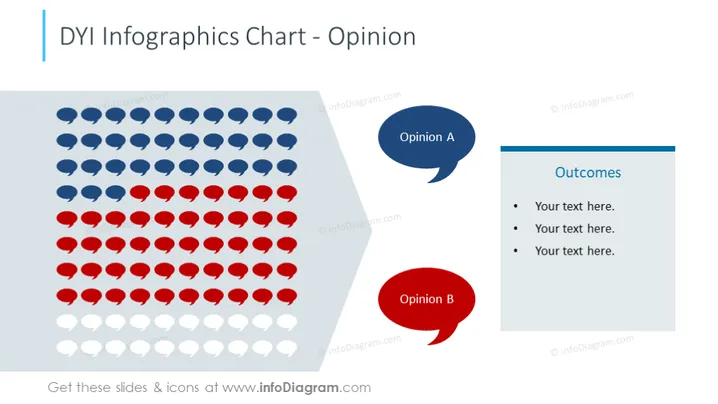
The PowerPoint slide presents a visual structure for comparing two different opinions (labeled Opinion A and Opinion B) using a graphical representation consisting of rows of icons. Next to this, there is a text box titled "Outcomes" with bullet points where one can list the results or conclusions drawn from comparing these opinions. Each opinion is represented by a colored speech bubble, suggesting a dialogue or debate scenario where two perspectives are being evaluated. The rows of icons can provide a quantitative visual comparison, such as voting results or divided stances on a certain issue.
The overall look of the slide is professional and visually balanced, with a clear focus on comparing two sets of opinions through both iconography and textual elements. The use of color-coding aids in distinguishing between the perspectives being compared.


