Your graphics add a nice touch to my presentations and I recently used them for one of my all-hands meetings. Your toolbox adds professionalism to my slides. Instead of using standard clipart.
Claude Jones, Director of Engineer, @Walmartlabs, USA
Your graphics add a nice touch to my presentations and I recently used them for one of my all-hands meetings. Your toolbox adds professionalism to my slides. Instead of using standard clipart.
Claude Jones, Director of Engineer, @Walmartlabs, USA
I needed a fresh look at some of my slides. I've tried to find a way to create a paintbrush effect, to underline, accentuate, add some color and the handwritten markers were just the things. Very easy to use, easy to size, change the color. It was an affordable, perfect solution and I'm happy to recommend it.
Anonymous, US
The crisp, clean look of the graphics, and the fact that it allowed me to easily edit and change the colors to match the template was my main reason for purchasing them.
Brandie Jenkins, E-learning Developer, USA
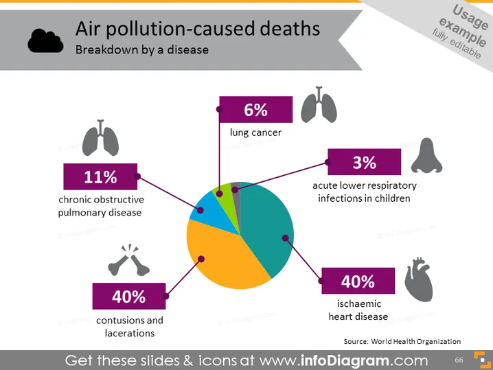
The pie chart shows the breakdown of air pollution-caused deaths by disease. There are four categories each depicted by a different color and labeled with both a percentage and the name of the disease: 11% of deaths are caused by chronic obstructive pulmonary disease, 40% by contusions and lacerations, 6% by lung cancer, and 40% by ischaemic heart disease. The remaining 3% is attributed to acute lower respiratory infections in children. Each category is linked to a corresponding icon that visually represents the affliction.
The slide has a clean and modern design, with a visually striking pie chart providing a clear and immediate visual representation of the data. The icons are simple yet effective in conveying the medical theme of the content.


