Your graphics add a nice touch to my presentations and I recently used them for one of my all-hands meetings. Your toolbox adds professionalism to my slides. Instead of using standard clipart.
Claude Jones, Director of Engineer, @Walmartlabs, USA
Your graphics add a nice touch to my presentations and I recently used them for one of my all-hands meetings. Your toolbox adds professionalism to my slides. Instead of using standard clipart.
Claude Jones, Director of Engineer, @Walmartlabs, USA
I needed a fresh look at some of my slides. I've tried to find a way to create a paintbrush effect, to underline, accentuate, add some color and the handwritten markers were just the things. Very easy to use, easy to size, change the color. It was an affordable, perfect solution and I'm happy to recommend it.
Anonymous, US
The crisp, clean look of the graphics, and the fact that it allowed me to easily edit and change the colors to match the template was my main reason for purchasing them.
Brandie Jenkins, E-learning Developer, USA
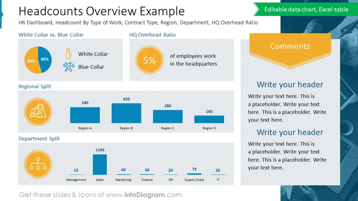
The slide presents a statistical breakdown of an organization's workforce, categorized by job type, regional distribution, and departmental allocation. It features a "White Collar vs. Blue Collar" pie chart showing a split of 55% to 45%, an "HQ Overhead Ratio" highlighting that 5% of employees work at headquarters, a "Regional Split" with numerical distributions across four regions, and a "Department Split" providing headcount figures for management, sales, marketing, finance, HR, supply chain, and IT departments. Each section is accompanied by icons that visually represent the categories, emphasizing the data's divisions and allowing for at-a-glance comprehension of the company's structural demographics.
The slide has a well-organized layout with clearly defined sections for different data points and a harmonious color palette. The icons and charts are used effectively to illustrate the quantitative information, enabling quick visual interpretation.


